05 Jul Is Your Healthcare Facility Stressed? This May Be Why
When I was working primarily as a Feng Shui consultant for the residential market, I repeatedly stressed the argument that if your space is in order, you will be as well. When a space is “in order,” it provides an experience of balance, harmony, and clarity to all who walk in the door—–I call that an integrative space. People can feel what an integrative space is all about even if they don’t know how or why, even if it’s an unconscious recognition.
It follows that a healthcare facility also transmits a message and let’s hope it’s an integrative one as well—one that speaks to body, mind, and soul—-balance, harmony, and clarity. If a space is stressed or in any way unsettled, then that message is transferred to the people who come there, many of whom are trying to heal.
How does a place get unsettled and stressed? One way is clutter.
The word clutter comes from the French word “to clot”—–something that creates a lump or obstruction, a gathering together of materials into a thick mass. Clutter does not create an experience of smooth transactions or peaceful moments. Rather, it clogs up the space which, in turn, stresses the patient.
Here are 3 areas where clutter is typically found:
- Exam rooms – Leaving pamphlets around about procedures, conditions, protocols, etc. which a patient can peruse while waiting is not restful. It may be educational on some level, but it doesn’t provide a patient with a quiet moment or two. Having some magazines may be a short-term distraction but they aren’t always uplifting. How about a book of poetry or a book of inspirational sayings? What about a book of artwork or some other kind of hard-cover coffee-table-like book?
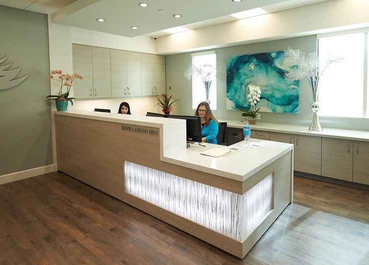
.. - Counters – It’s fair to say that often a patient ends up filling out paperwork or arranging payment on a counter which is prolific with racks of brochures, medical studies, and data sheets. This information may be about payment methods or patient rights or a particular health condition—-free for the taking and totally informative. However, I argue it would be cheaper, and contribute to less clutter, to hand the patient the one that’s relevant and, in turn, provide them more space to easily fill out the paperwork. Keep them off the counter thereby de-stressing the whole experience and letting the patient feel comfortable.
.. - Entrances – First impressions are everything. Walking into a front entry with racks of newspapers, trash receptacles, and wheelchairs all lined up may not be the message a healthcare facility wants to broadcast. This is certainly a utilitarian message but where’s the one about feeling welcome and safe? What about an attractive place to sit? What about a more decorative floor option? What about a place for some artful treatment of the walls?
I realize many of the suggestions can’t be implemented. Having wheelchairs by the front door is an absolute necessity, for instance. I also know that though some of these suggestions, although simple, are not easy. Removing a plant nurtured by someone who is quite proud of its growth and vitality in order to make more counter space may cause its own stress. But being aware of keeping the facility with as little clutter (and stress) as possible will pay for itself in patient experience.
